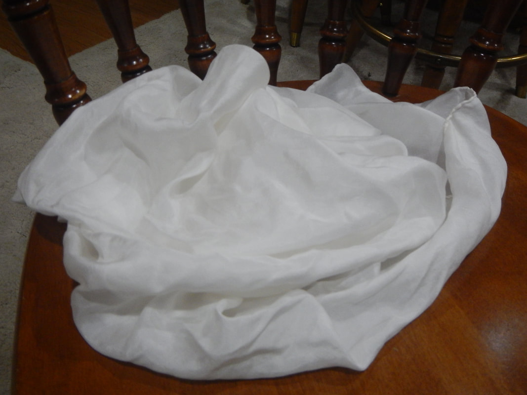
There's only one problem: the results are bright clear colors, and I want richer, autumnal tones. Think, think, think... I could tea-stain them first, then dye them with the sharpies! TEA STAINING
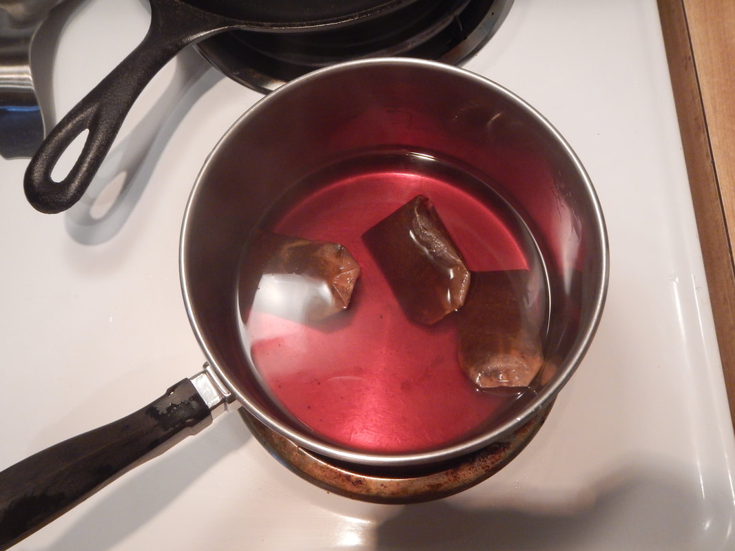
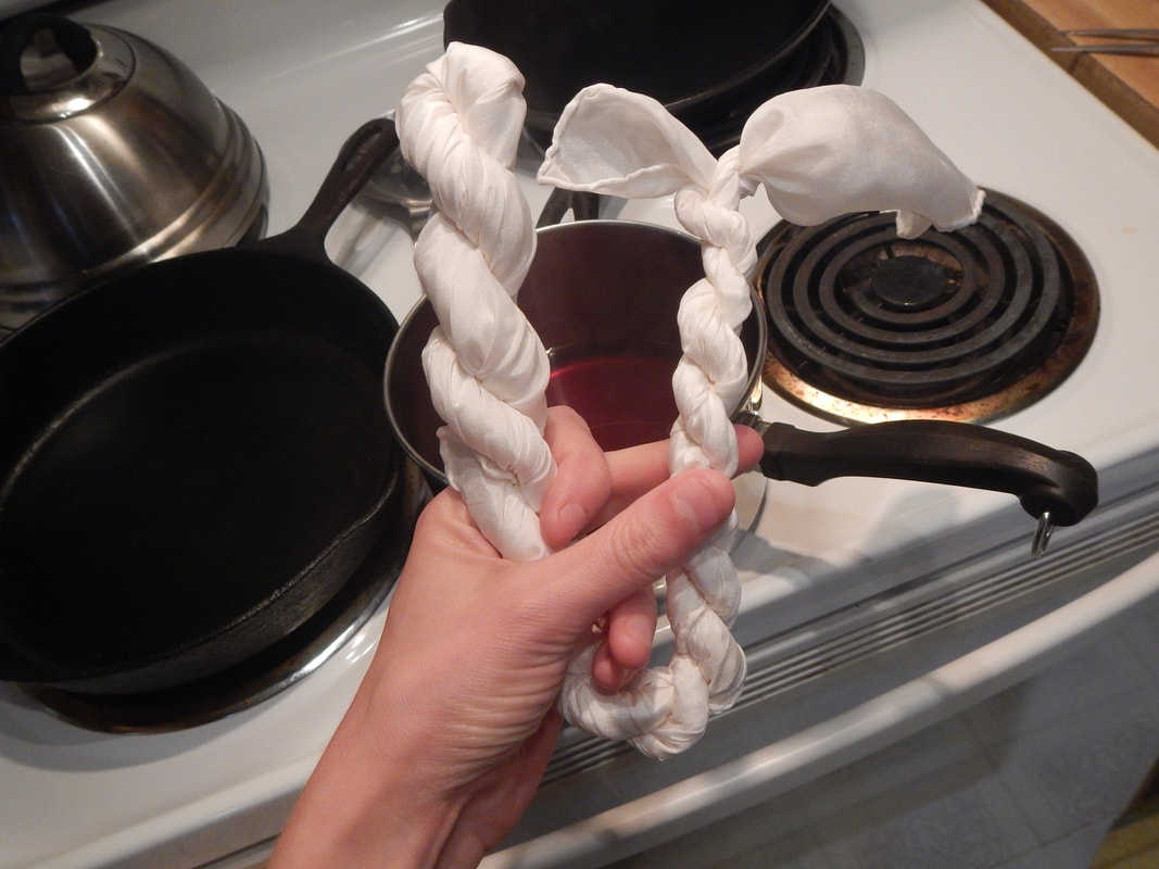
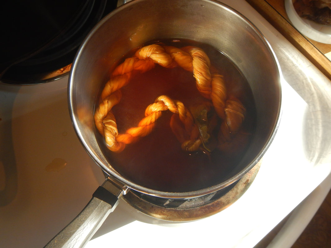
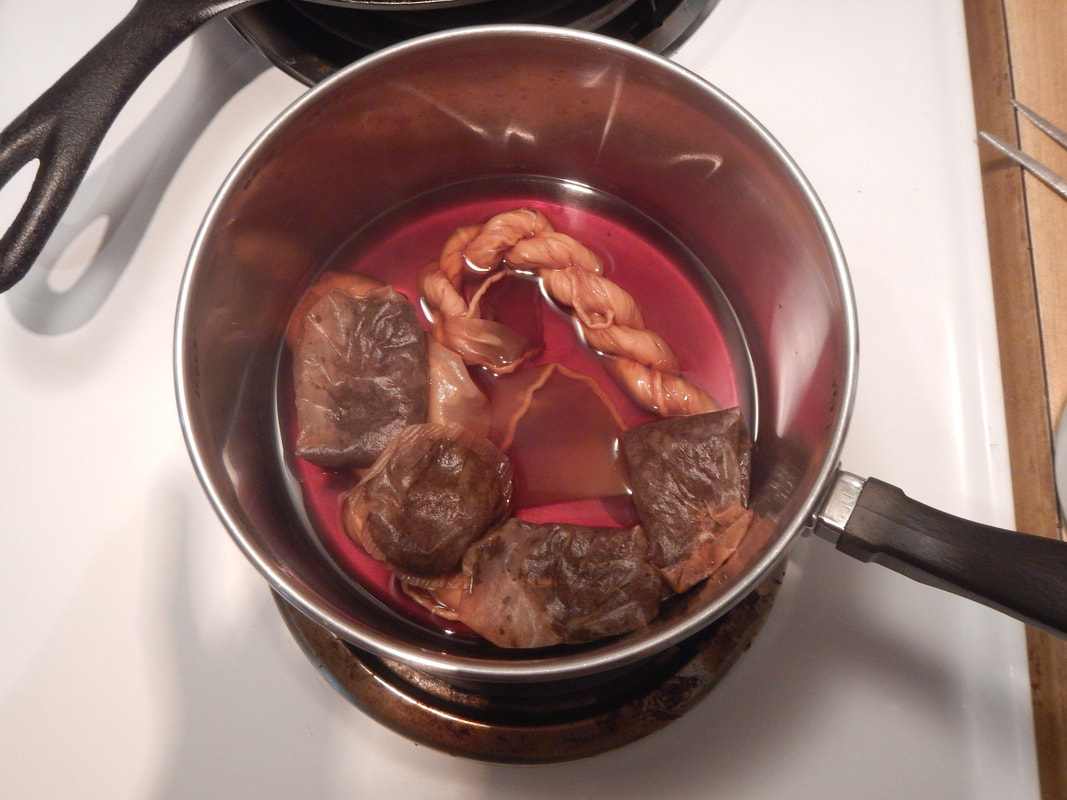 dyeing One night I brew up a very dark black tea, using three Red Rose tea bags. I splash some apple cider vinegar in there for "bite", to help the fibers hold the color. (Online tutorials suggest white vinegar, but I can't find any in my laundry room, so I go for the apple cider stuff I have in the kitchen.) After twisting the scarf into a cord, so that some areas will resist the dye, I submerge it in the brew and stack the tea bags on top of the cord in hopes that those areas will stain even darker. I leave it overnight. The next morning, here's what I have.
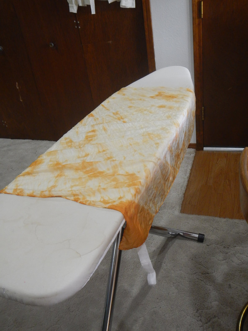
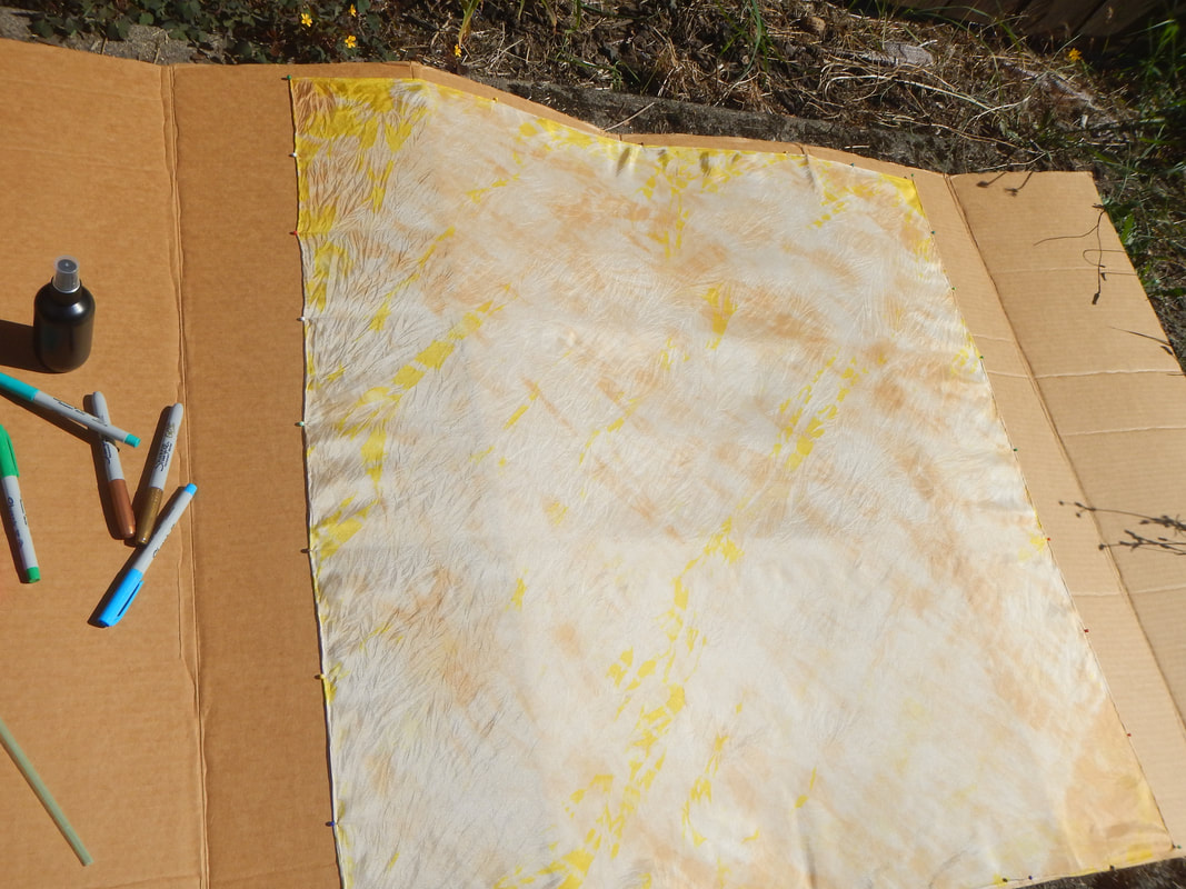
The results after the second bath are nice: 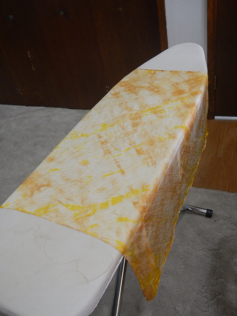 The turmeric made a great stain! I press it, and it's ready for the next step. SHARPIE AND RUBBING ALCOHOL My next step is to pin out the scarf on a large cardboard base and start doodling on it with Sharpie markers. (The reason for Sharpie markers is because they are alcohol-based, and so when I spray them with alcohol they will run, which is the goal.) I discover, to my dismay, that I don't have big markers, only fine-tipped ones. Oh well, let's see how it goes!
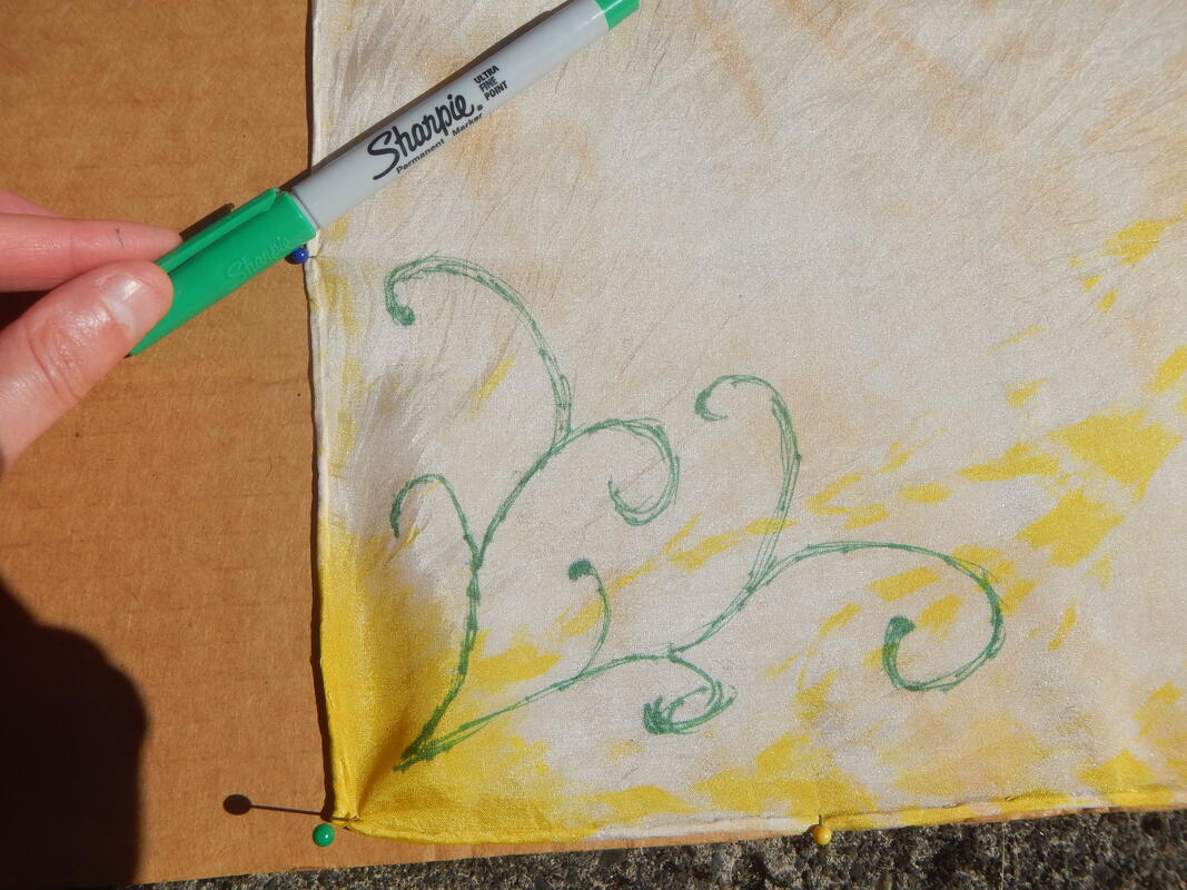
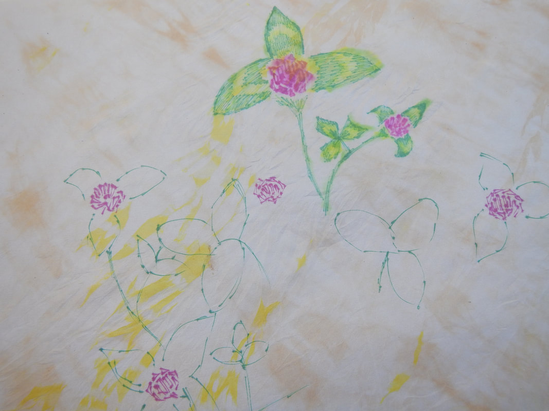
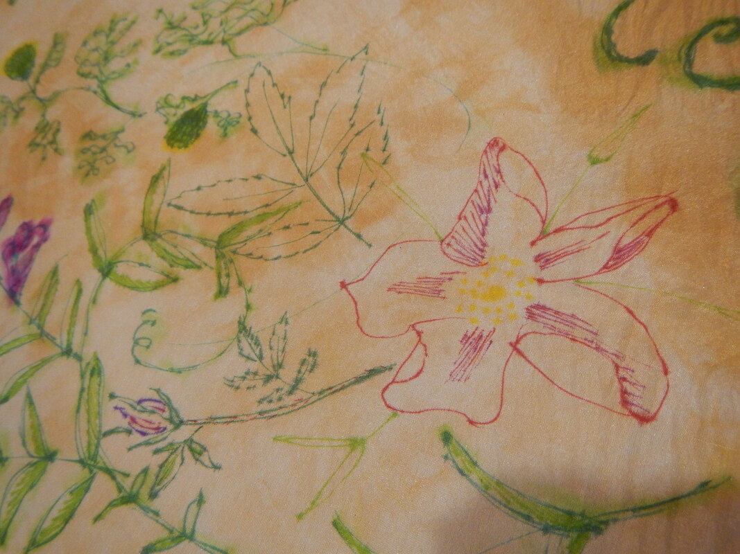
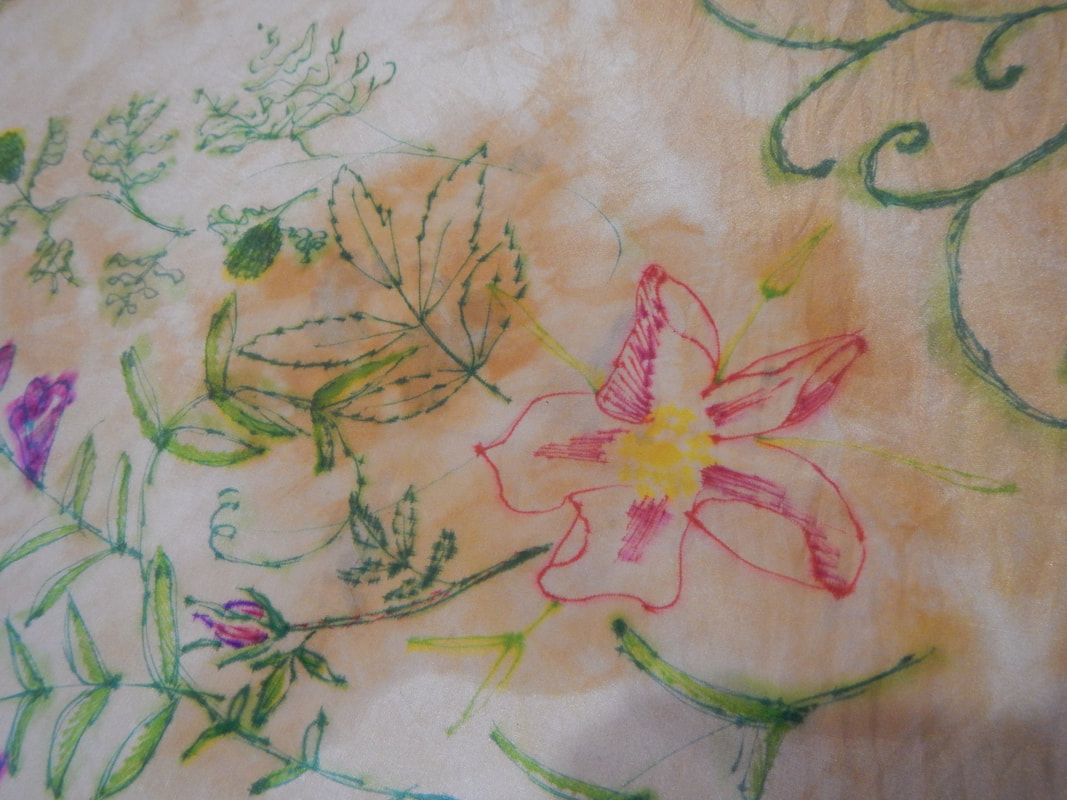
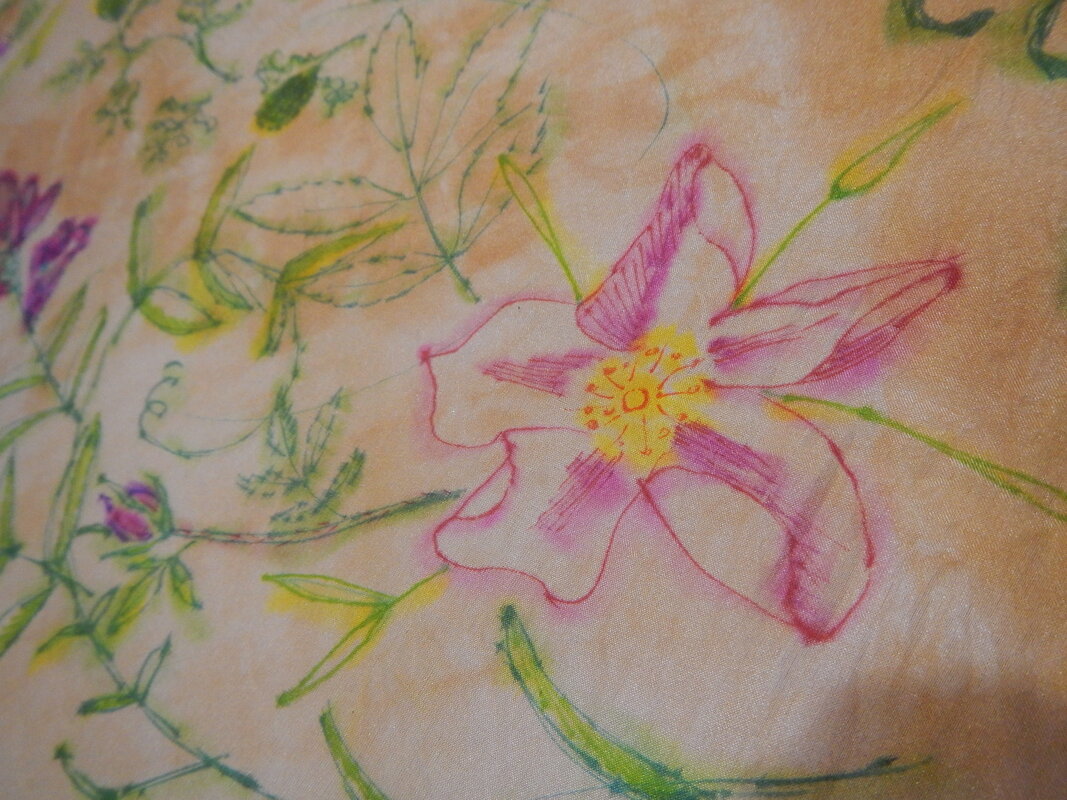
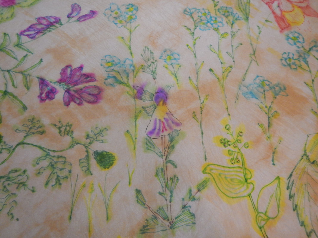
The fine-tipped Sharpies are tricky to write with because the silk keeps shifting, but I quickly get the hang of a light, barely-there stroke with lots of re-drawing the same line. I draw a swirly sprig in the corner, then spray with isopropyl alcohol to see how it changes. It doesn't blur and splotch as much as the examples I've seen online, but then again, I am not using nearly as much ink, either. What does happen is that the scratchy edges of the lines soften and blur, and a sort of halo effect happens with diluted ink: green dilutes to yellow, red to pink, and blue to lavender. I proceed slowly, building my picture up in layers. For example, when drawing the purple sweet pea, I scratch out basic flower shapes in magenta ink, and cross-hatch with blue ink, then spray with alcohol. The magenta and blue run together to look purple. Then I take more of the blue ink and draw in clearer lines around the edges so the flowers still look like flowers. Similarly, with the clover, I re-touch the blurred flowers after they have dried, and add a few more leaves as well, so the picture has a mix of blurry lines and sharp ones. The more layers I add, the cooler it looks, like botanical prints on an old parchment.
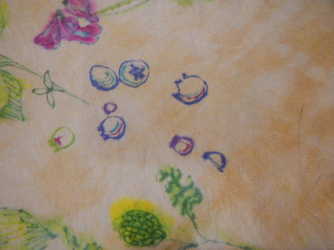
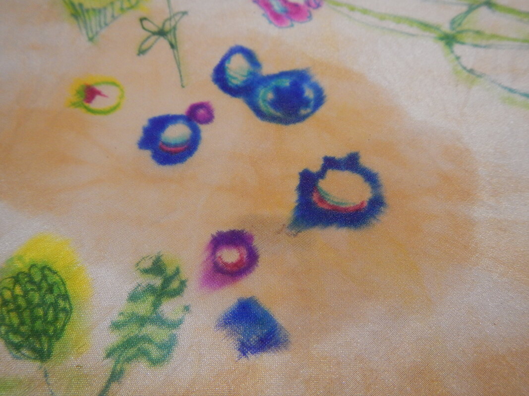
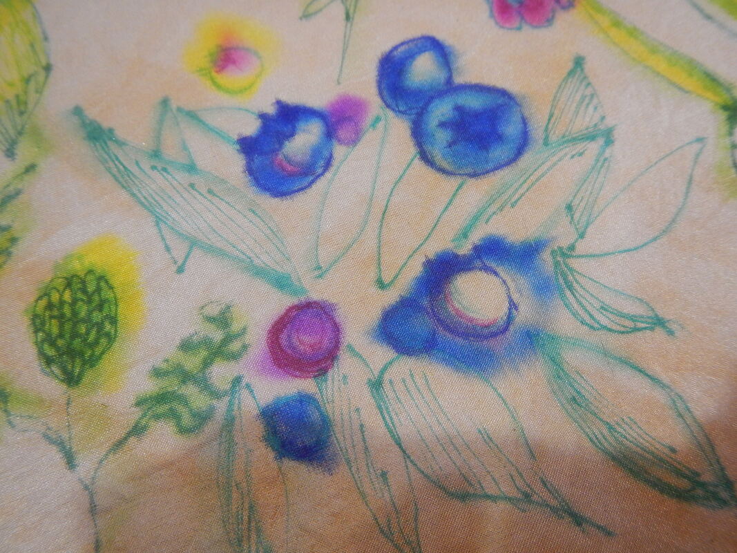
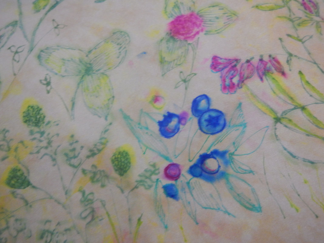
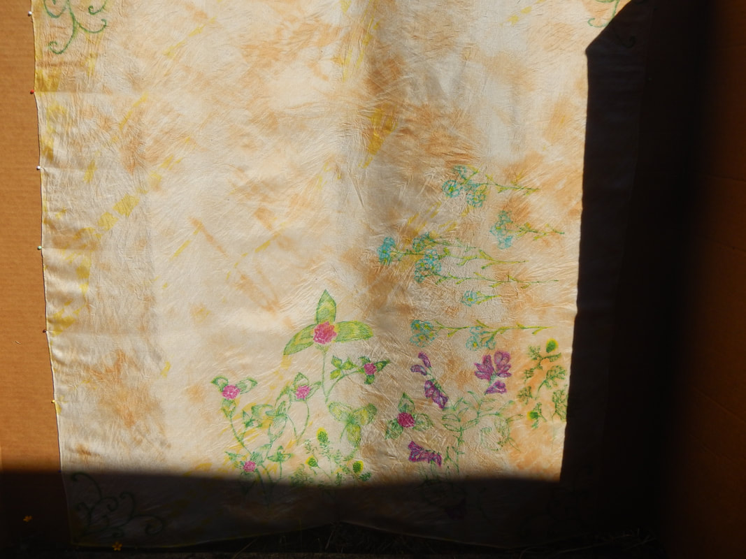 The more I work on it, the more I like it, though it's straying pretty far from my original autumnal vision! PROCESS SHOTS Here are some process pics and the lessons I'm learning as I go. Let's start with blueberries. I draw the blueberries in (first pic, nice sharp lines), then spray with isopropyl alcohol (second pic) so the ink starts to run. I like the way the color looks richer at this point; it makes me think of flow blue ceramicware. However, it's also blobby and ill-defined, so I go back in and draw in the details, as well as some leaves.
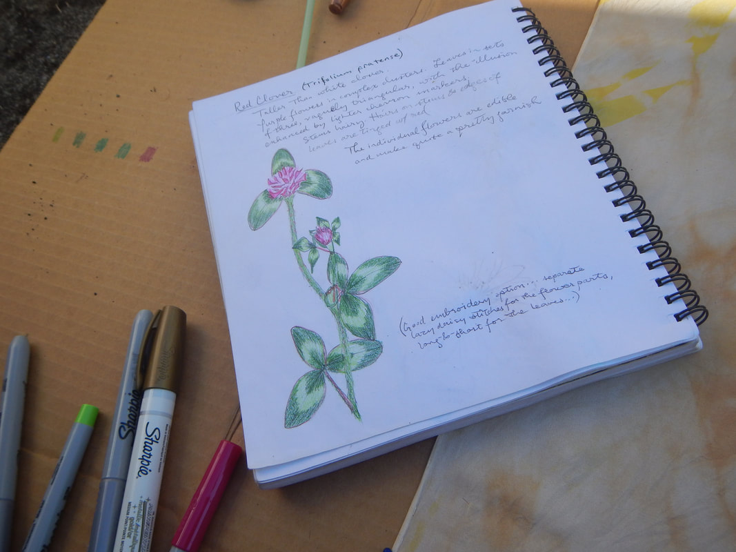
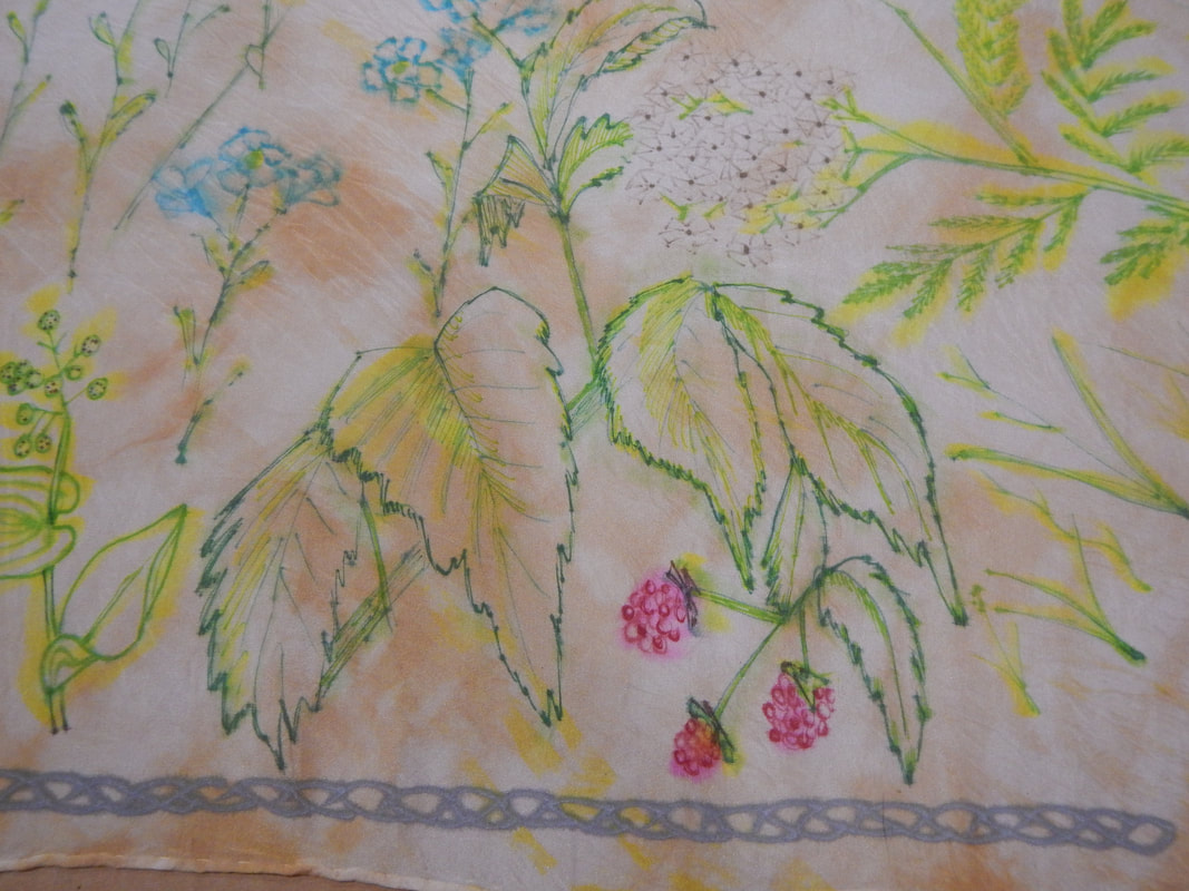
What I've learned is that the dark inks look a lot messier when they blur than the light ones do... Like, if you look at the pineapple-weed (Matricaria discoidea) in the lower left corner, you can see the green ink runs to yellow, which is not distracting. But the blue ink runs bright blue, so must be used more carefully. Let's see how a rose develops, step by step. This is a wild rose of some type.
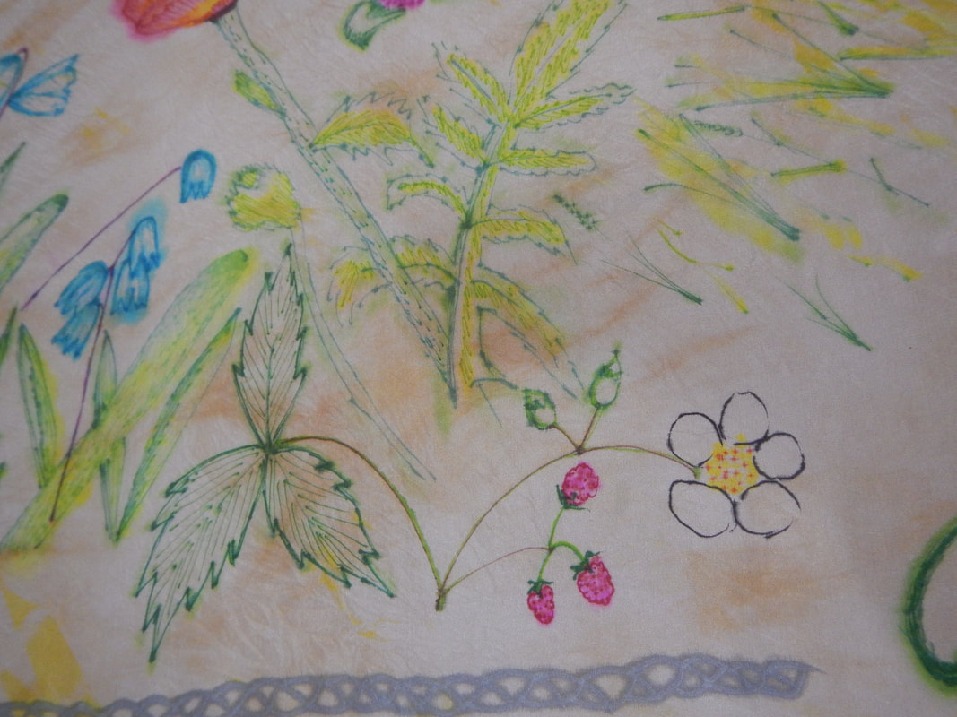
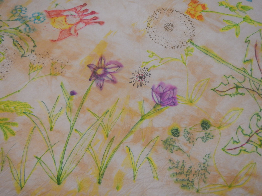
PRE-WASH PICTURES Here's the whole scarf when I'm done all my drawing and spraying: 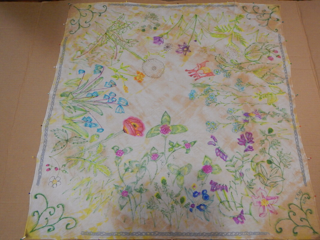 Aw, my mom was right: I AM special. :P White flowers are the hard ones to represent... I use black ink to draw the outlines after the alcohol is all dried and evaporated.
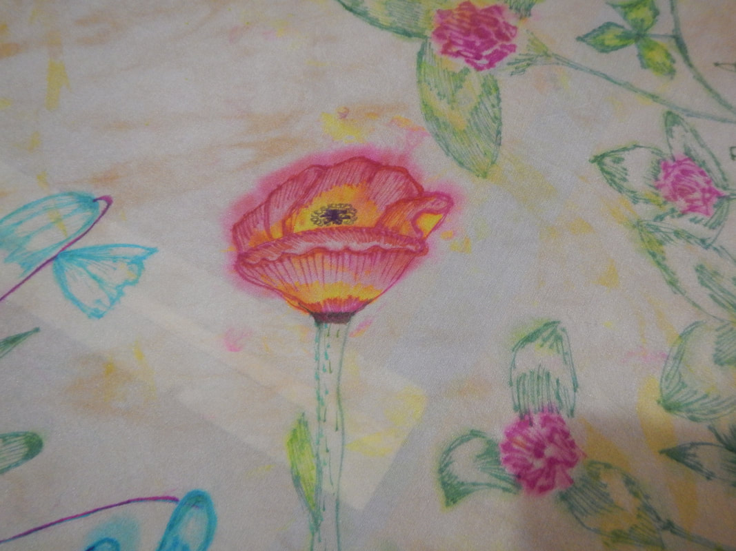
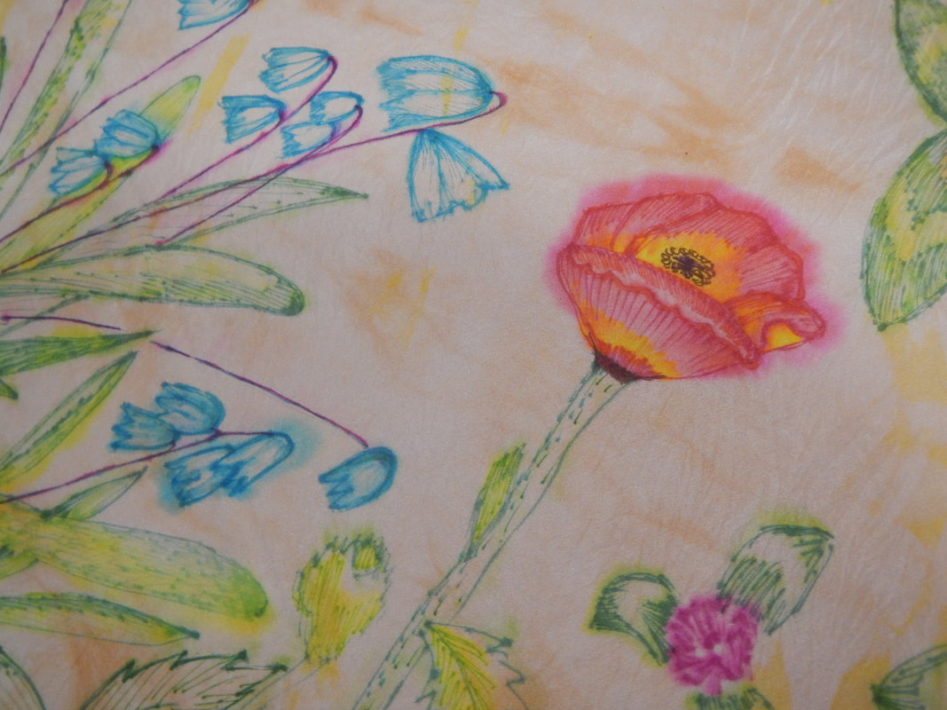 Siberian squill and poppy and clover
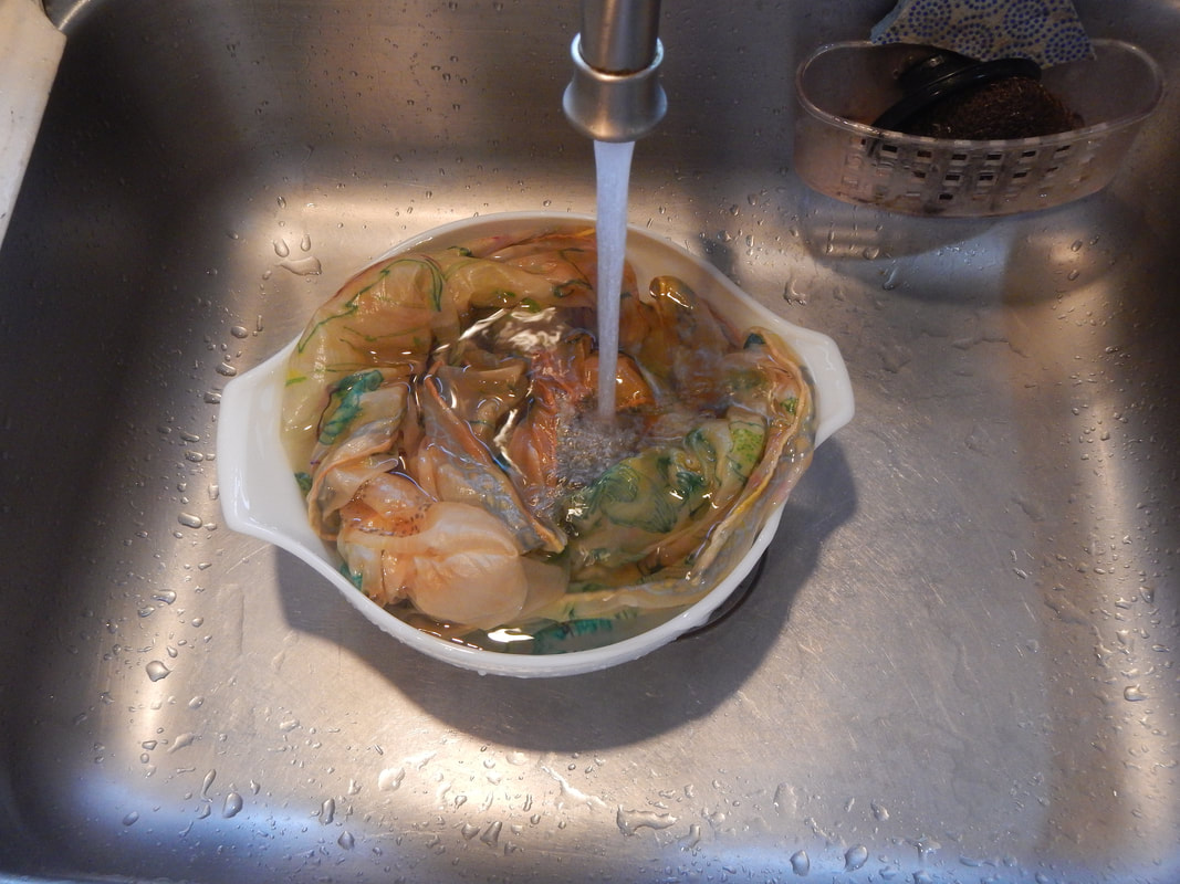
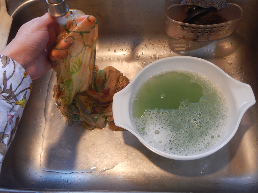
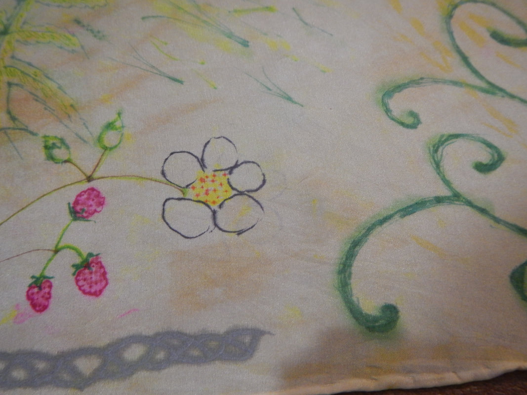
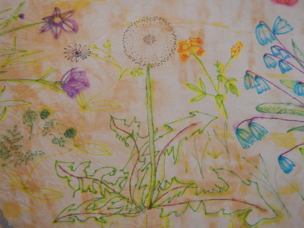 I just love dandelions! I used Sharpie metallic pens to get the seeds of the puff-ball, and used a black fine-tipped marker for the petals of lesser stitchwort. SETTING AND WASHING The next, scary, step is to set the ink and wash the scarf. It's scary because now, after all this work, I really like the scarf as-is and don't want to see it all run down the drain! But the ink must be set so I can wear it. So... first, a vinegar bath (1 cup water and a half-up vinegar). I dip the scarf in there, then put it in a plastic colander over a basin of water and microwave for a minute. It comes out steaming. I rinse it in cool water until the water runs clear. Then I wash it with Synthrapol, which is a detergent that removes excess dye from fabric, so it won't run in future washings. When I wash in Synthrapol and hot water, the water turns green!
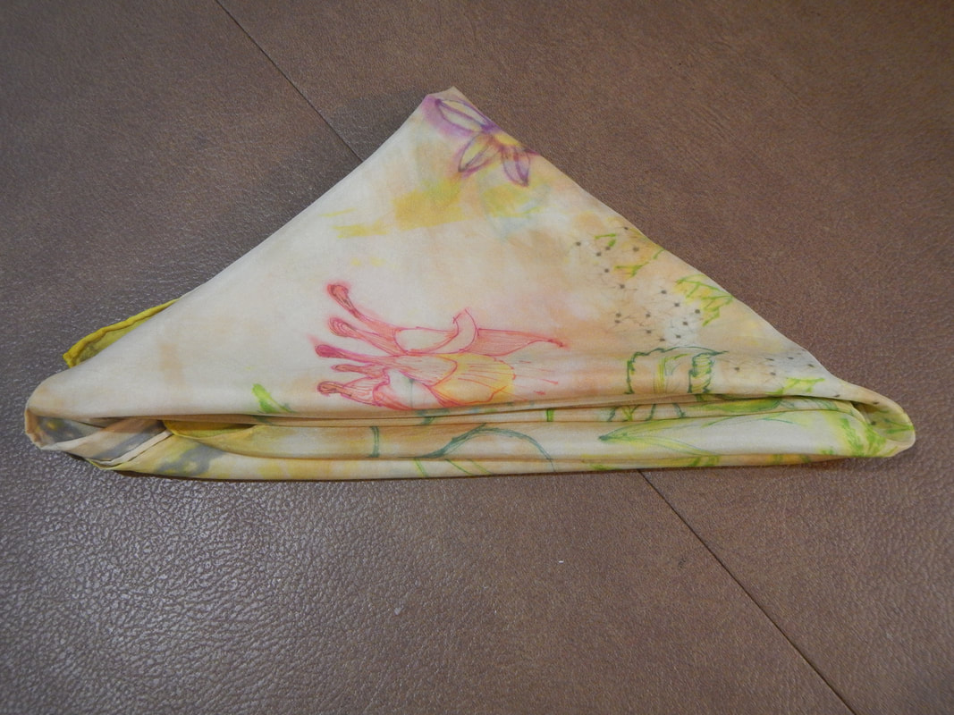
I roll it in a towel to press excess water out. Then I iron it, and look how pretty it is! 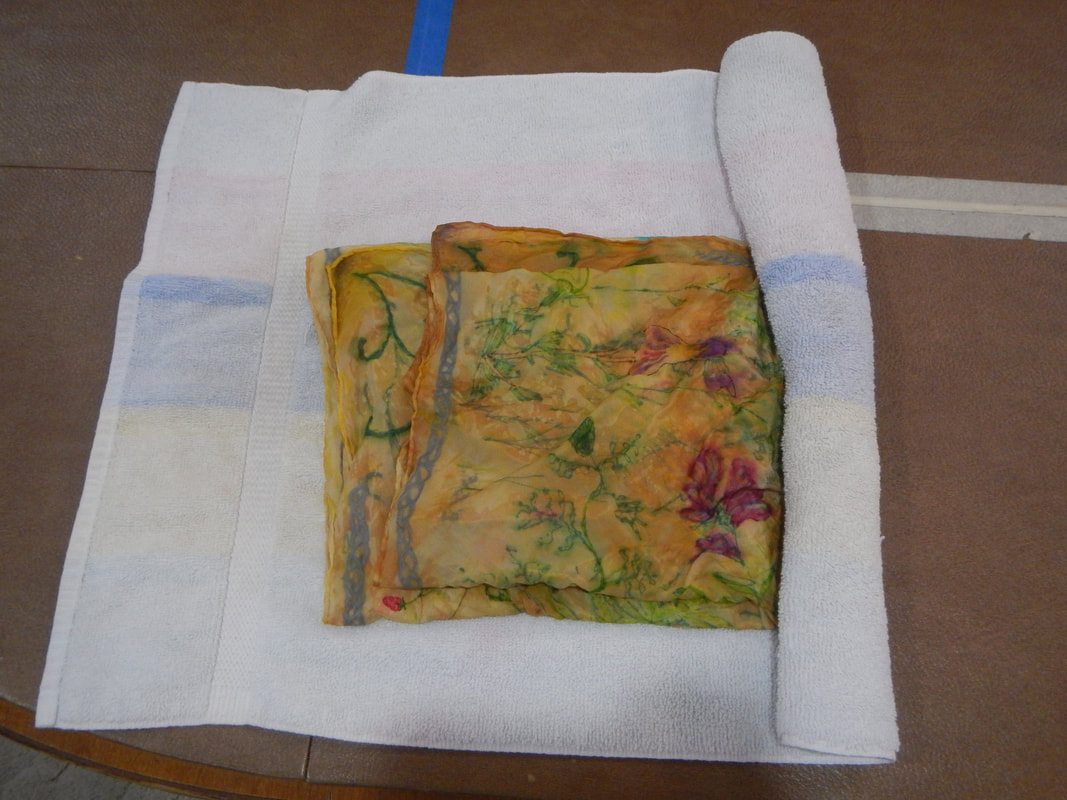 It might be a teensy bit less vibrant than the pre-wash, but still really pretty! 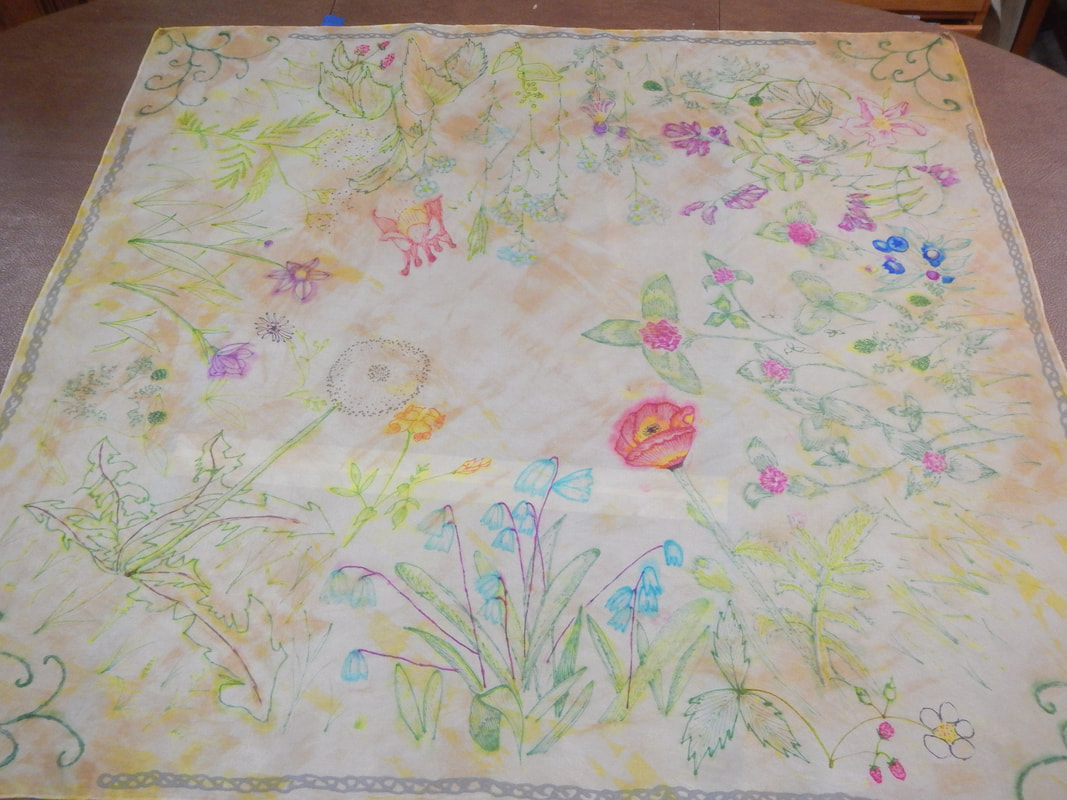 The ink ran in a few places, probably during the microwaving step when the scarf was crumpled in a bowl and the brightest spots were touching other parts of the scarf:
But none of those spots are distractingly bad.
1 Comment
The Sister
9/17/2019 07:41:04 am
I like seeing all your Minnesota drawings come back for a cameo. It reminds me of your knowledge of wild plants! I especially like the poppy flower you made on the scarf; good job on everything! I'm sure you'll find a lovely outfit to wear with your new addition. Leave a Reply. |
Karen Roy
Quilting, dressmaking, and history plied with the needle... Sites I EnjoyThe Quilt Index Categories
All
Archives
March 2024
|

 RSS Feed