|
NOTE: This project involves non-medical use of isopropyl alcohol. I did this in February, before the spread of Covid 19. Now I have time to blog about it, but now I am also saving my alcohol for potentially vital uses! May people be sensible and God be merciful--may we soon see a decline in Coronavirus cases worldwide! Only then will I indulge in further play with alcohol as a solvent. After having so much fun dyeing and doodling on my silk habutai scarf (September of last year), I decided to make a bunch more, and see if they're salable. I had money in my business account from the custom sewing and alterations I did the last few years, so why not use it for prototypes? I ordered the following scarves from Dharma Trading Company: 12 Silk Satin, 12 mm, 17"x17" 12 Silk Charmeuse, 19.5 mm, 22"x22" 12 Crepe de Chine, 12 mm, 25"x25" 12 Flat Crepe, 8 mm, 22"x22" How did I decide which ones to order? I went for the ones that were discounted. I figured why shell out when I don't yet know what I like? I also got a quart of Synthrapol, a detergent that gets excess ink out of scarves after dyeing. My total for this order was $271.12. A DUD IDEA
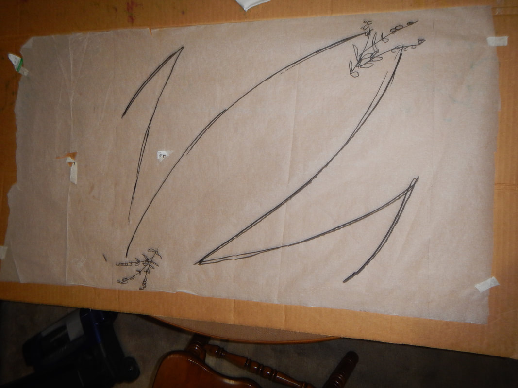
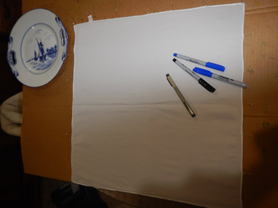
FIRST IMPRESSIONSWhen the scarves came in, I was less than impressed. The hems look amateur: the rolled edges are large, uneven, and sometimes only half-rolled. Some threads are already coming out. Next time I order, maybe I should get the machine hemmed ones. It only makes sense to pay extra for hand-hemming if the hand-hemming is well done. Moreover, the scarves are not cut perfectly on grain, so they aren't neat squares. Given how easily charmeuse and crepe de Chine tear on grain, it seems incredible that the makers chose to cut instead of tearing! Maybe they have a machine that cuts out hundreds at a time, but in that case the risk is always that the layers of fabric shift during cutting, and the ones at the bottom end up all askew. Finally, I couldn't tell the difference between the silk charmeuse and the satin (the silk charmeuse was heavier than I expected and felt like a satin), or the crepe de Chine and the flat crepe. So why bother getting both varieties? Next time I order, I will pick more distinct weaves, like charmeuse and habutai, or crepe de Chine and jacquard. Also, next time I will certainly get larger sizes, since they are only just big enough to tie around the neck. That is my mistake, not a fault in the product. Still, I have a bunch to play with, and I won't feel too guilty if I screw them up, seeing as how they're not ideal anyway. (As usual, I switch to present tense for the project diary.) LAVENDER FIELDS For my first scarf, I start by drawing a rough guide to the main lines I'd like to build my design around. Dark black Sharpie on tissue paper is all I need. When I pin the scarf atop the tissue paper, I can see the lines through the scarf, and they serve as guides for where to put my flowers.
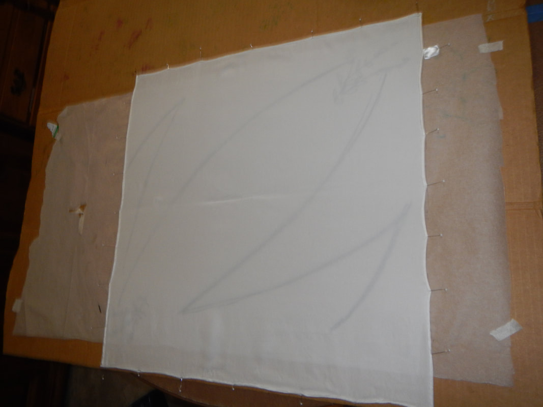
There are two ways I experiment with drawing the lavender. I do a more impressionistic faraway view of the whole plant, and a larger, botanical drawing of the sprigs. The next three pictures show the scarf at different stages. I doodle, spray with alcohol to make the ink run, let it dry, and come back repeatedly. 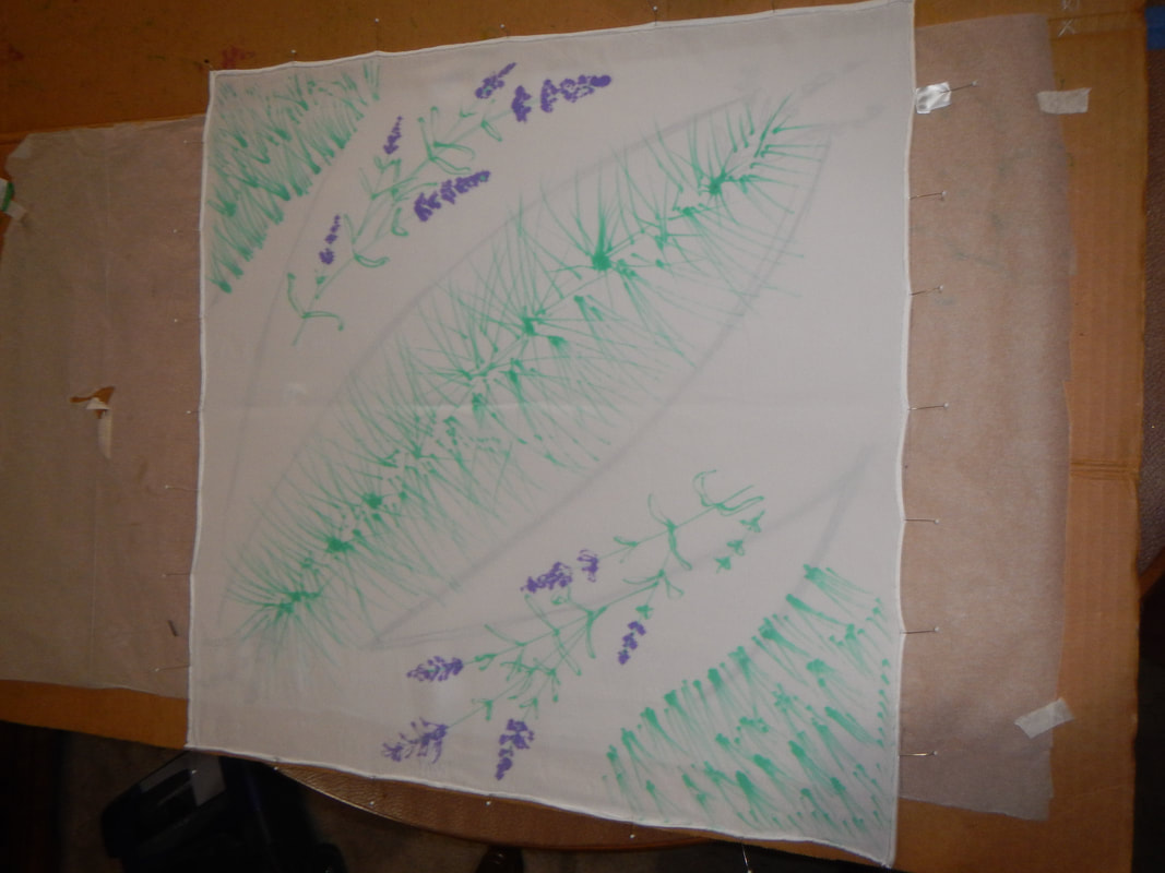 First layer. See how the black guides under the scarf help me with placing my motifs? 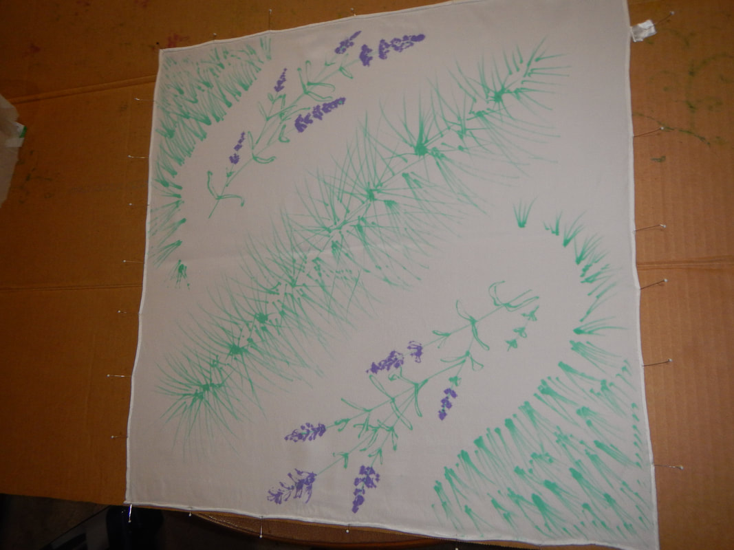 I took the guidelines away once they were no longer needed. 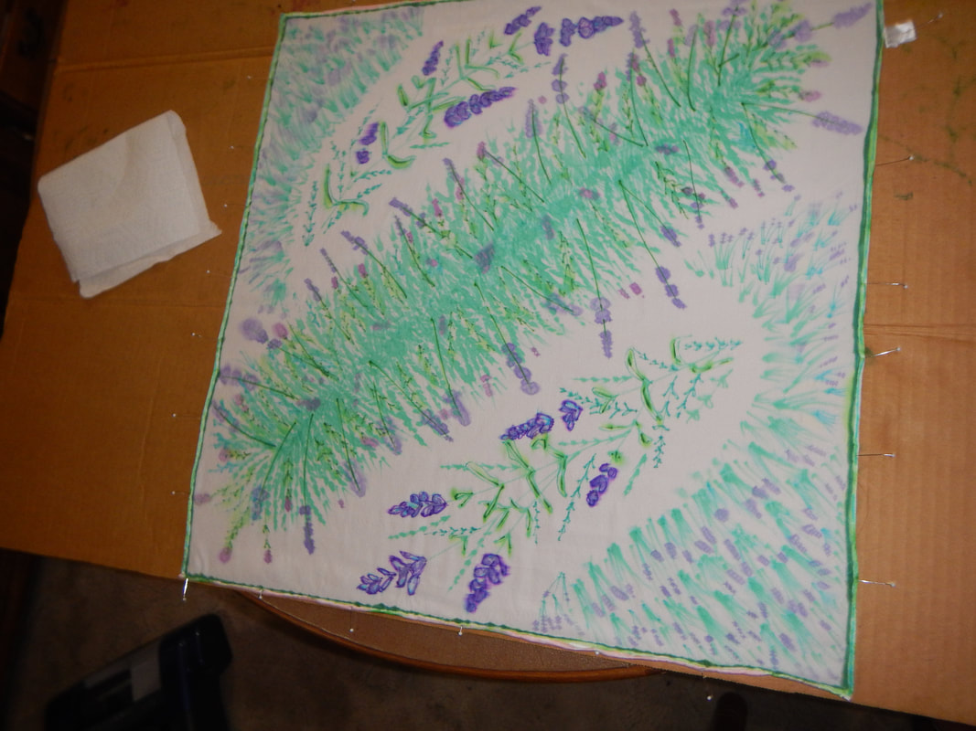 Finished design. I like the finished look of individual flowers, but not the look of the whole design. I fear the bed of lavender in the center looks like a centipede! But I console myself that once the scarf is folded into a triangle, if doesn't look like so buggy. If I revisit this design, I need to think about clustering motifs in the corners and less distinct texture in the middle. FREMONT BRIDGE
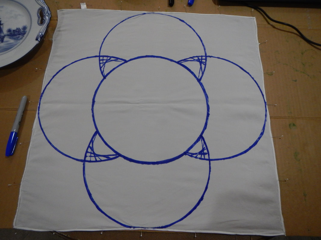
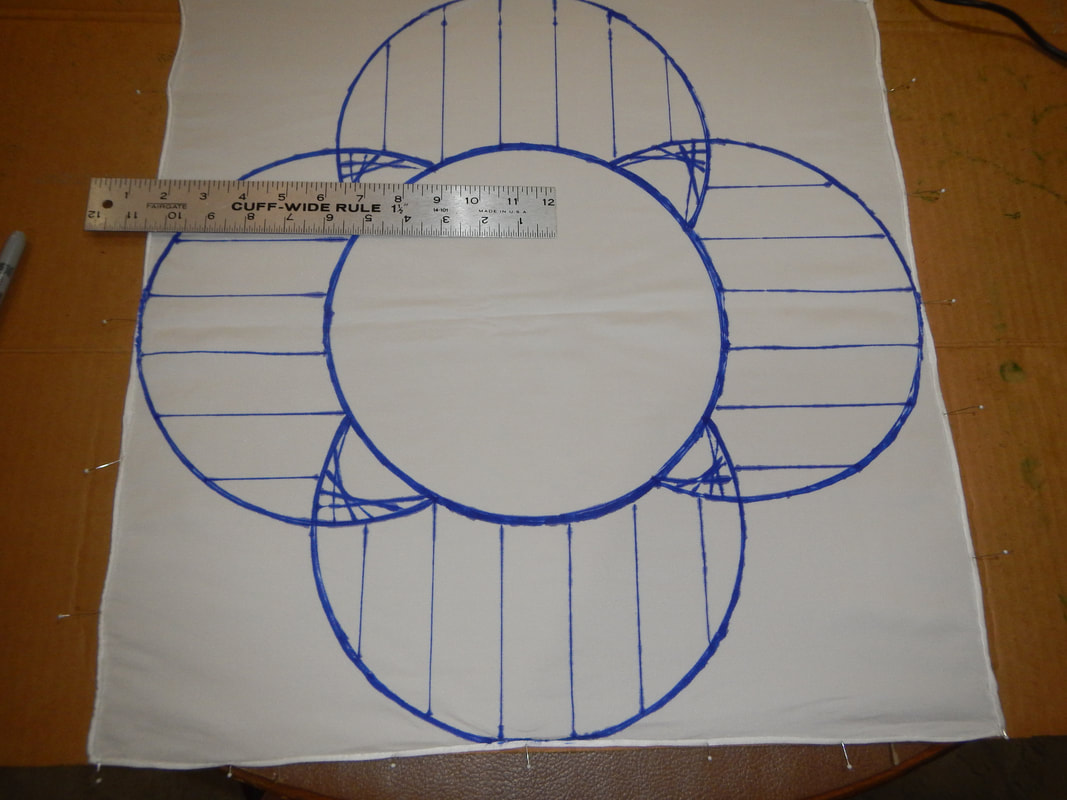
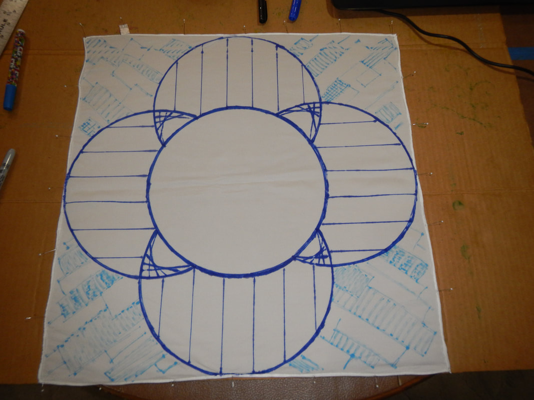
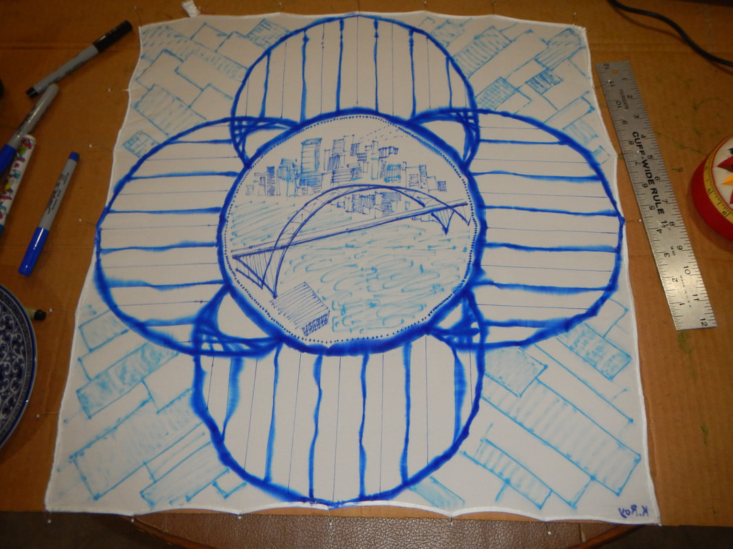
The next three pictures are my initial sketch. I trace a plate to get four circles intersecting each other. I draw some "cables" on them like the cables that depend from its arches. Then I fill the background, the corners of the scarf, with abstract skyline blocks.
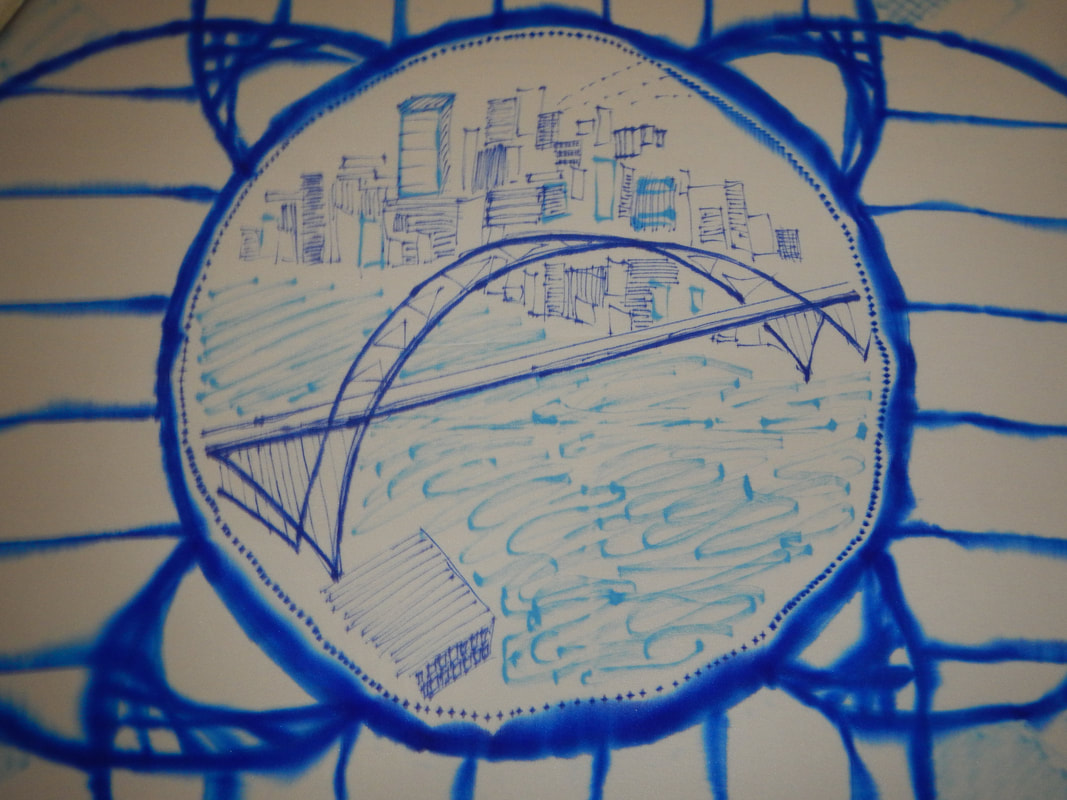
And now it's time to spray with alcohol! Look at it run! Somehow, the blurry edges of the blue make all the blue look more vibrant. I love it. It's like looking out of a shower curtain or wet window... the world gets so watery and diffuse! 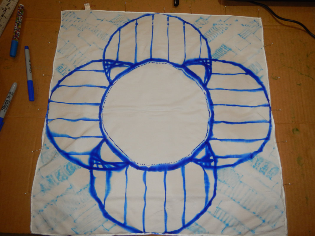 Inspired by my Dutch plate (visible in the first picture), I draw a scene in the center of the scarf. The scene is the Fremont Bridge, Portland Oregon, seen from the northeast bank, with downtown and the West Hills on the other side of the river. I base my drawing off of this photo by Bruce Forster (viewfindersnw).
FIRE HYDRANT IN CROCUSESThe last scarf I did, which is my favorite, is also a longer story. And I have to take pictures of it. So check back later for the fire hydrant in crocuses!
1 Comment
The Sister
3/19/2020 09:36:57 am
Ah, it's good to see a blog post again! I'm glad you've got productive plans for your sabbatical! I hope you find it very relaxing and engaging! Leave a Reply. |
Karen Roy
Quilting, dressmaking, and history plied with the needle... Sites I EnjoyThe Quilt Index Categories
All
Archives
March 2024
|
 RSS Feed