Ahem... My Evolving Tastes, by Karen Roy. When I started quilting I didn't know what styles appealed to me most, but much quilt-viewing and some quilt-sewing later, I have a better idea. I can appreciate, but don't want to make...
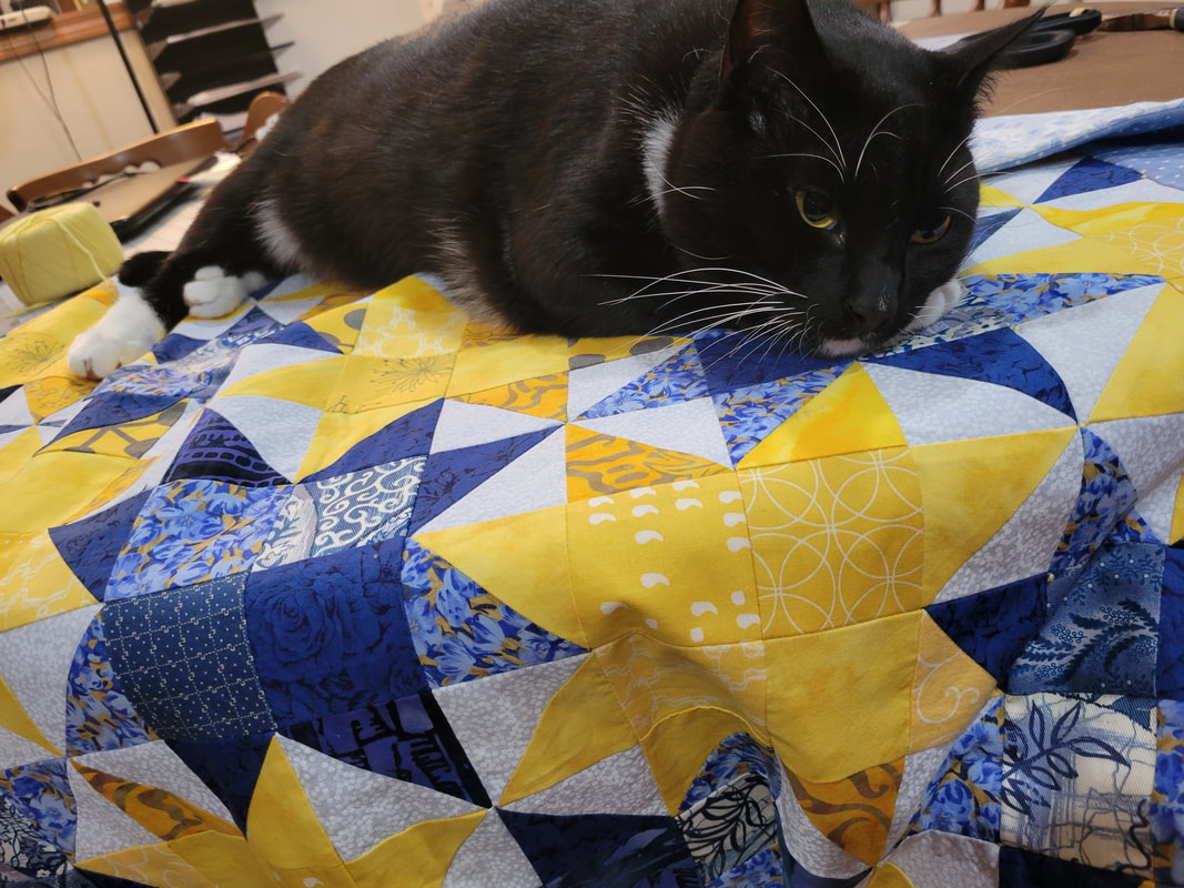
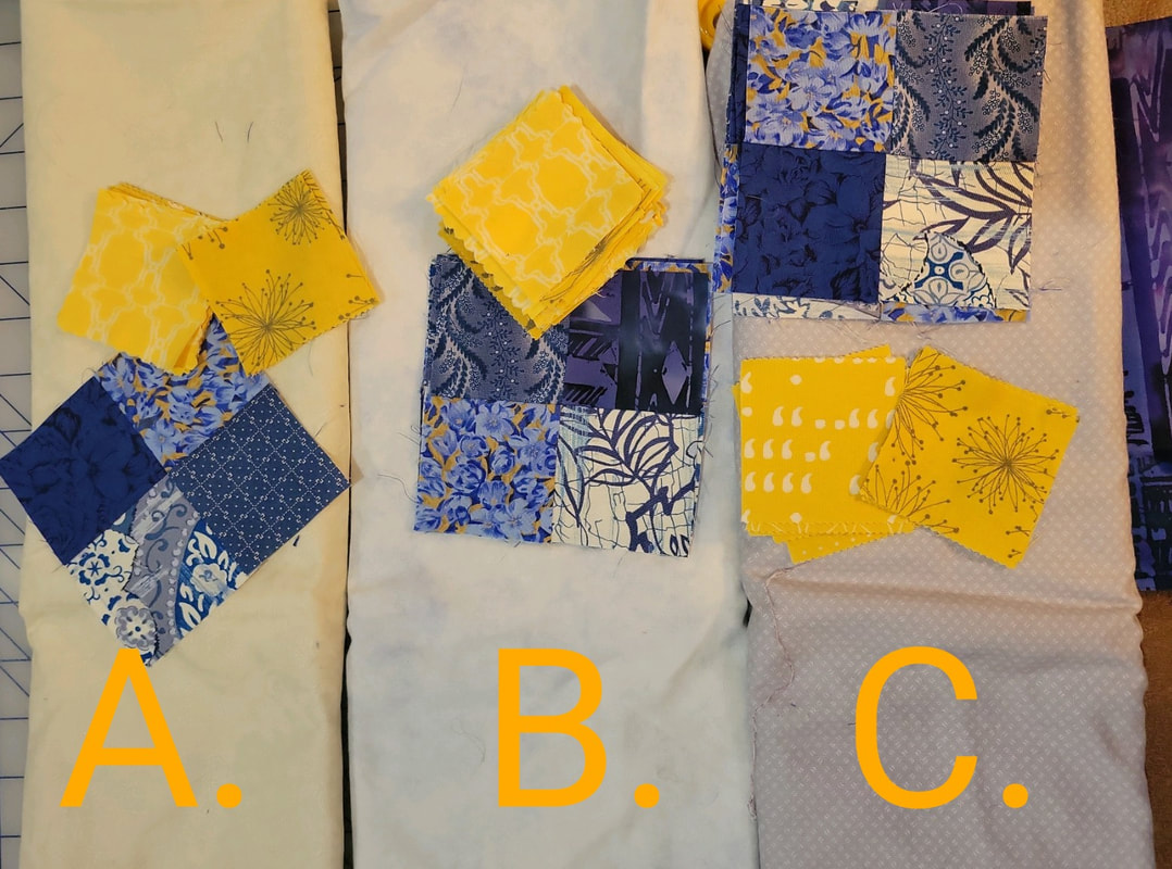
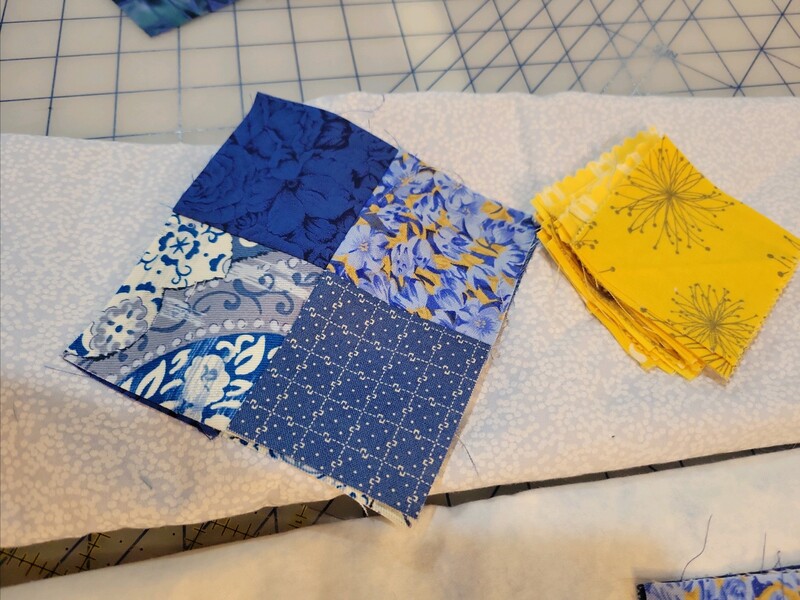
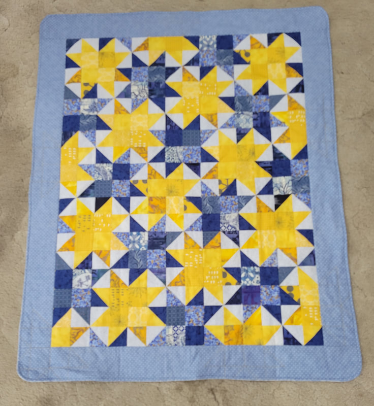
The Sunnyside pattern is perfectly to my tastes: its clever layout allows a second set of sawtooth stars to appear in between the first stars. The creator, Myra Barnes of Bellingham Washington, says "I happened upon the design when I was playing around in EQ8 one day." I was fascinated; it couldn't possibly be made by making individual sawtooth stars the usual way. If you made a bunch of the stars in two colors, they could sit next to each other like books on a shelf, but not nest into each other as in this pattern. I looked at it for about ten minutes, doodling, and came up with my own pattern based off their picture. I did not purchase their pattern-- the biggest appeal of a pattern is that it tells you how much fabric to buy and how to cut it, which wasn't relevant for me, because I was working from stash. Aside from using uniformly sized squares, I didn't think about size at all until the quilt was nearly done; then I was like "Hmm, it's a little small. Lemme add a border." Subsequently, I emailed Busy Hands Quilts to see if they cared about my reverse-engineering their pattern and blogging about it, but as I haven't received a reply I will err on the side of caution. I will show you what I made, but not use screencaps from their website nor show you how I deconstructed their pattern. If you want to make the pattern yourself, you can purchase their instructions! Instead of talking about the pattern, I will talk about color! COMPLEMENTARY COLORS? I have plenty of yellows and blues to work with: yellows from my previous quilting projects and blues from my housemate's! Someone looked at it and said the colors were "complementary"... but they're not, really. Yellow and blue are both primary colors, which means that if you are working with additive color models and you add one to another, you'll get a secondary color: Yellow (primary) + Blue (primary) = Green (secondary). The three primary colors are Yellow, Blue, and Red. Secondary colors are green (yellow + blue), purple (blue + red) and orange (red + yellow). The word "complement" means "thing which makes something complete", and a "complete" set is all three primary colors: Yellow, Blue, and Red. So a primary color's complement is always a secondary color which is made of the other two primary colors. On the color wheel, the complementary colors are always directly opposite each other. The complement of yellow is purple, which is made of red and blue. Likewise the complement of blue is orange, which is made of red and yellow. This can be expressed like color algebra: Yellow + (Red + Blue) = Yellow + Purple Blue + (Yellow + Red) = Blue + Orange Red + (Yellow + Blue) = Red + Green In other words, when you see a primary color, its complement will be whatever secondary color has the components needed to "complete" the primary triad. When you see a secondary color, its complement is whatever primary color it doesn't contain within itself. Though yellow and blue are not complementary, they do look good together, with nice high contrast. SATURATION The main colors being picked out, I needed to decide on an unobtrusive background color. I find my smart phone very helpful for this, since I can take a picture and view the colors at a remove, thereby seeing things which close handling has obscured. I can also text the pictures to people and poll them about which colors to pick!
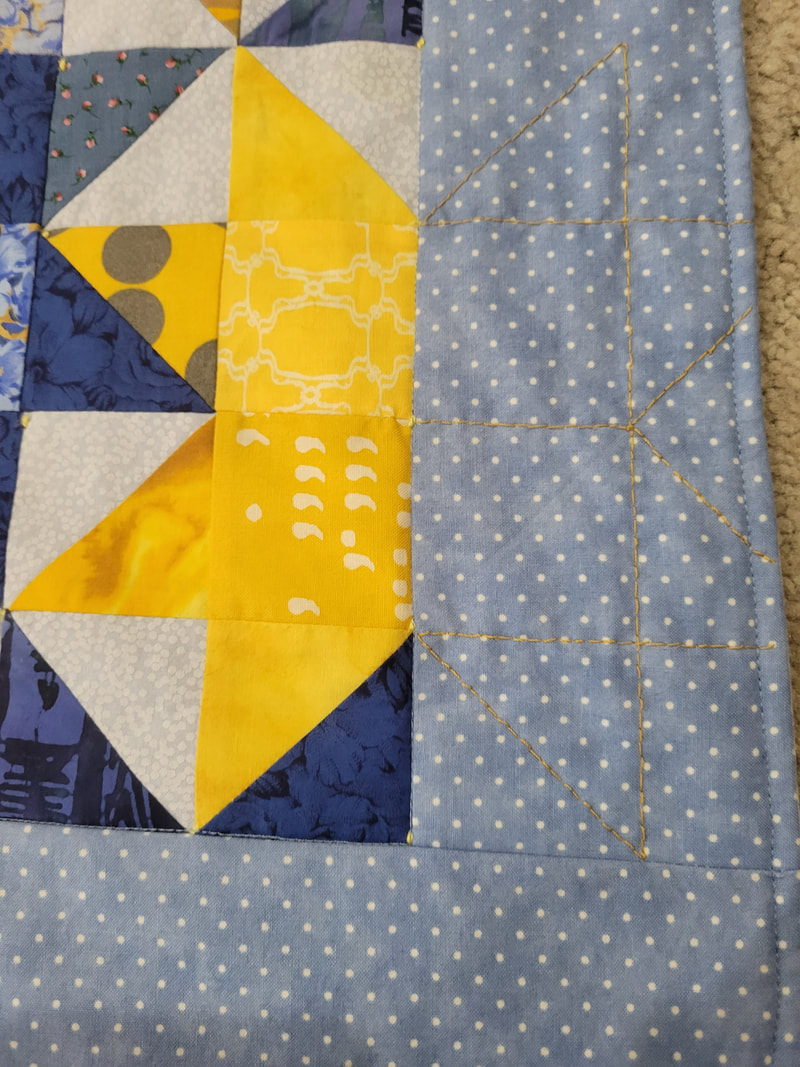
For instance, here I vetoed A as too warm in tone, and C as too dull. B was a contender, but eventually I picked the unlabeled one because its tone-on-tone print seemed like stars or snow. Another way my smart phone helps me is by allowing me to switch from color to black & white, and thus evaluate saturation and contrast alone. Here's what I sent to my friends and sister when trying to decide on a border. I got two votes for light blue and two votes for dark... so I (sneakily) sent the poll to the expectant mother, without telling her the quilt was for her, and she said she preferred the light blue for being softer. Light blue it is! 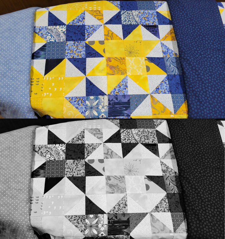 TYING A QUILT As with my other baby blankets, I used the envelope method to enclose the edges. I like that for small quilts, because I dislike binding. Time constraints forestalled any thought of quilting this one, so I decided to tie it. I'd never tied a quilt before, but it wasn't too hard. The hardest part was having to use pliers to pull the yarn through all the layers of fabric! I decided that little tufts all over would interfere with the pattern, so I opted to just use some crochet cotton and take small backstitches at regular intervals to hold the quilt sandwich together. After washing and drying, a quilted quilt crinkles up, but this tied quilt hardly changed at all. I find I prefer the look of quilting, but tying has its utility. I also did some decorative stitching to continue the yellow stars into the borders, and finished with a top-stitched edge and stitch-in-the-ditch for the inside border.
2 Comments
The Sister
10/4/2022 10:19:25 am
I do really like the star pattern too. It's not too busy but still looks like a complex motif which could work in any size. How did the mother like it, especially since you sneakily asked her opinion? Leave a Reply. |
Karen Roy
Quilting, dressmaking, and history plied with the needle... Sites I EnjoyThe Quilt Index Categories
All
Archives
March 2024
|
 RSS Feed